
You’re a frontend developer constructing a real-time dashboard. Your product stakeholders require fluid interactivity with 100,000+ data points updating every second, and the deadline is 90 days.
If you pick the wrong charting library, you could end up spending three weeks refactoring to address performance bottlenecks or delivering a performance-lagging interface that significantly erodes user retention prior to being able to implement any changes.
Many developers choose a charting library for React based on its number of stars in its GitHub repo or how many blog tutorials are available for it. This is not a reliable metric when building large-scale dashboard applications.
We compare React chart libraries by evaluating their performance and depth of functionality, and show you which of these are built for complex and heavy-duty dashboard applications. We assess these charting libraries based on how React-compatible the library is, how well the library is built to display large data sets, the number of chart types available, the level of customisability, and the developer experience.
We reviewed five libraries, and they each took a different approach to building their charts: several specialise in extreme scale rendering, some offer a huge range of chart options, while others focus on speed of prototyping with little setup needed.
Prior to reading our review, it’s helpful to know what to look for when selecting a library for production, as selecting the wrong one can have major consequences as you scale the app.
Key Features to Look for in a React Chart Library
To get the charting library that fits your needs, you need to match your technical requirements to what the charting library is able to deliver for the needs of your application.
Does the charting library have robust support for React?
It’s not enough to have a React component wrapper. The component must be written in a manner consistent with the React ecosystem:
- Use of hooks,
- Component lifecycles,
- Props,
- State.
Will the chart perform with large amounts of data?
The number of points the chart can display at any one time without freezing depends on the rendering method, data structure, and browser capabilities. If your application streams real-time data, you will need to ensure the chart can handle a reasonable number of data points or use the streaming data capabilities that some of the best charting libraries provide.
If the number of points in one chart could be large, you may also want to consider if the chart is able to render using canvas. Canvas-based rendering typically outperforms SVG past 5,000 datapoints, while GPU acceleration becomes critical above 100,000.
Does the library support the right kind of charts?
There are many different types of charts, including stacked bars, area charts, line charts, heatmaps, scatter plots, bubble charts, 3D surfaces, treemaps, Sankey diagrams, Gantt diagrams, pie charts, gauge charts, donut charts, radar charts, sunburst charts, candlestick charts, and many others.
A library with 95+ chart types eliminates vendor sprawl when requirements expand. You need to check that a chart library can deliver the types of charts that you’re going to need for your application.
Is the customization sufficient for your needs?
You need to check that the chart library has options for customizing its display: styling hooks, control of the axis, customization of the tooltip, legend, colors, and fonts, and any other display options that you are going to need.
What’s the learning curve?
Does the API offer a configuration approach that feels natural for your team? The more complex chart libraries offer more features and customization, which comes at the expense of configuration complexity.
However, some of the simpler libraries don’t go far enough, and it may prove difficult or impossible to achieve some customization.
Does the chart library have a large community of users?
If it’s a well-known library, it likely has more users, documentation, and third-party tutorials on it to help you to get it working with your needs. Enterprise libraries should offer long-term support contracts, not just community goodwill.
These are some of the key things to consider when choosing the right charting library for your dashboards.
Quick Comparison
Scan this table to see which library matches your performance needs and dashboard complexity—from GPU-accelerated extremes to rapid-deploy simplicity.
| Firm | Chart Types | Performance (Large Data) | React Integration | Customization Level | Best For |
| SciChart | 2D, 3D, Geo, Heatmaps, Polar | 100M+ points at 60 FPS | Native React wrapper with hooks | Deep programmatic control | Real-time financial and scientific dashboards |
| Highcharts | Core, Stock, Maps, Gantt, Grid | Handles millions efficiently | Official React wrapper included | Extensive config-driven options | Enterprise-grade accessible dashboards |
| Fusioncharts | 95+ types, 1400+ maps | Strong with medium datasets | Zero-config React integration | Theme-based with JSON configs | Multi-chart business intelligence panels |
| ApexCharts.js | 20+ modern chart types | Good up to 50K points | React-ApexCharts official package | Moderate via options API | Interactive dashboards with minimal setup |
| CanvasJS | 30+ types plus StockChart | Fast HTML5 Canvas rendering | React component available | Straightforward API customization | Lightweight financial and data-heavy apps |
Top 5 JavaScript Chart Libraries for React
We judged these five options based on the complexity of real-world dashboards, rather than the size of their GitHub followings. They all do an excellent job of integrating with React, scaling to large data sets, and offering customizability, but each sacrifices some combination of performance, functionality, and developer ease-of-use.
These five firms have the best tech stack for production-level dashboards in 2026.
Highcharts — Enterprise-grade suite that balances accessibility with production-ready React integration
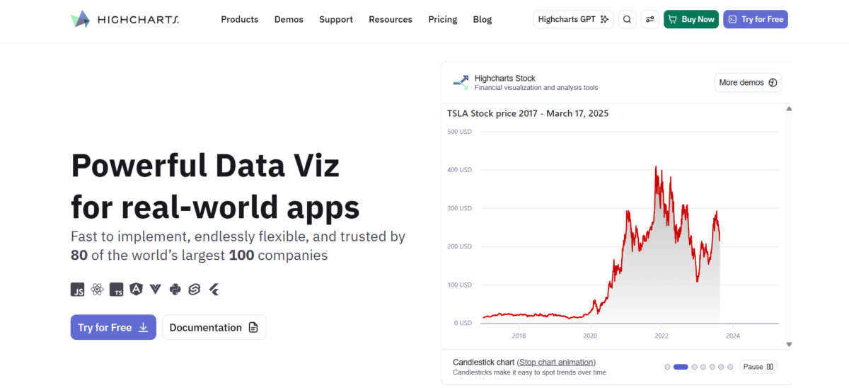
Highcharts is really the way to go if you are creating a comprehensive, multi-functional analytics platform since it comes with a full suite of modules (Core, Stock, Maps, Gantt, Grid, Dashboards).
You do not need to use wrapper libraries or maintain community forks for React since that is part of the standard offering; Highcharts React works well in a wide variety of production environments and is well-documented and supported.
Unlike many other charting libraries, Highcharts does not compromise on accessibility; WCAG-compliant charting and other accessibility options are available by default with the library as opposed to being an add-on you must buy separately. Charts that are interactive can be used on both desktop and mobile applications, making them perfect for responsive dashboards without a bunch of extra breakpoint custom code.
Highcharts is an established industry leader in the charting industry, which means that they have regular release cycles, the option for enterprise-level support with long-term contracts, and the ability to get hold of a human in a production emergency.
Pros
- The extensive suite of modules means you don’t have to use multiple charting libraries, as Highcharts has modules for Gantt, maps, stock charts, grids, etc.
- Accessibility and internationalization are built into Highcharts from day one, meeting WCAG AA standards out of the box
- Highcharts React is maintained by Highcharts itself, not a community contributor
Cons
- Commercial license prices aren’t publicly listed and require requesting a custom quote, which doesn’t appeal to everyone
- Highcharts is bigger in file size than some other libraries when using less of the library’s capabilities, like using a simple line chart
SciChart — When you need to render millions of datapoints in real-time without dropping frames, SciChart’s GPU-accelerated engine is the only React library built for this scale
When you need to render millions of datapoints in real-time without dropping frames, SciChart’s GPU-accelerated engine is the only React library built for this scale.
Since 2012, SciChart has been tackling the biggest challenge in browser-based visualization: performance at massive scale.
With their proprietary Vx™ GPU-accelerated engine, SciChart offloads the chart rendering from the CPU to the Graphics card, so that rendering hundreds of millions of datapoints at 60FPS in the browser is actually possible, unlike canvas and SVG-based alternatives.
SciChart is being used by trading desks, medical imaging companies, and industrial IoT dashboards. If there were a chart lag, it would cost money or lives. It has 2D, 3D, Geo-maps, Gauges, Polar Charts, and Heatmaps, which makes it the best option for a complex multi-chart React dashboard.
The strength of SciChart is real-time data viz: streaming sensor data, live market ticks, telemetry data from 100’s of devices all at once. It scales; other libraries have a problem with 100k points, and SciChart isn’t even warm.
- Vx™ GPU-accelerated engine handles extremely large datasets
- 60fps of performance with millions of real-time datapoints
- 2D / 3D / Geo / Polar types of charts all in one library
- Used in production since 2012 in both Finance & Medical
- Enterprise licensing only, with quote-only pricing (no public price)
Fusioncharts — Visualization breadth specialist delivering 95+ chart types and 1400+ maps across every major framework
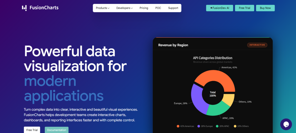
The strength of FusionCharts becomes clear when you have a dashboard that requires a variety of chart types. The library has 95+ types of charts, including standard column charts, bullet graphs, and funnel charts, and 1400+ types of maps ranging from simple choropleth to geographic visualizations.
Rather than having to stitch together multiple libraries in a single project, you can have all the visualizations that you require from one package. With over 20 dashboards for scenarios like sales reporting, finance, operations, etc. FusionCharts makes it easy to ship your dashboards with minimal effort.
Because it has an effortless integration with popular tools like React, Angular, and more, FusionCharts can easily get dropped into almost any codebase, allowing development teams to focus more on customizing the charts to suit their exact needs and less time trying to configure them.
FusionCharts supports a variety of technologies, and visualizing them across different tech stacks and ecosystems ensures your charts will look good no matter what your stack is, whether it is React, Vue, or a legacy jQuery dashboard. The library is able to transform data from raw to visuals fast, so users can see the insights they are looking for from the very start of development and don’t have to worry about a gap between having data and showing it.
- 95+ types of charts, including industry-specific ones such as those used for finance or science.
- 1400+ types of maps, including support for drill-downs to visualize data in a geographic context.
- Over 20 examples of pre-built production-ready dashboards.
- Framework-agnostic, official React bindings.
- Enterprise pricing: a sales team contact is required, so there is no public breakdown for budget planning.
ApexCharts.js — Modern charting that ships interactive features without forcing you to configure every pixel
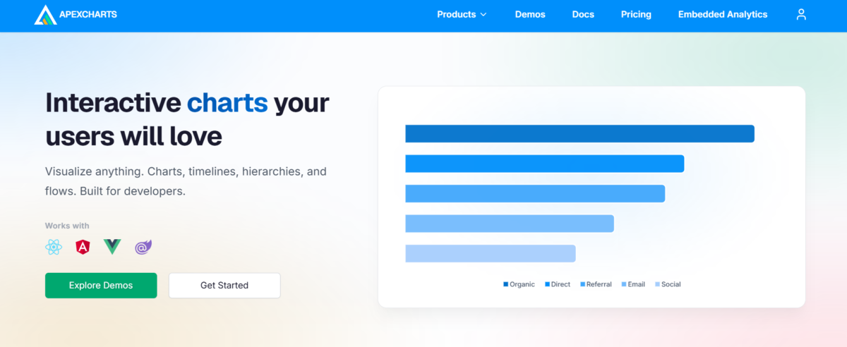
ApexCharts.js emerged in 2018, aiming to transform beautiful, interactive charts from an uncommon luxury into the norm. Its support for multiple frameworks (React, Angular, Vue, Blazor) keeps users from being confined to just one platform, while its more than 20 built-in chart types, along with native zooming, panning, and annotations, remove the need for extra plugins just to implement essential user features.
The library’s comprehensive documentation and ease of use shorten the learning curve; developers have been able to launch production-ready dashboards in a matter of days. Why? The API is easy to navigate, and its demos work right out of the box, rather than being mere proof of concept snippets. Its true power is rapid prototyping and building intermediate-sized dashboards that prioritize creating engaging, interactive user experiences with limited setup time over churning out real-time data updates of hundreds of thousands (or millions) of points per second.
For business scenarios like analyzing sales figures, tracking user activities, or compiling financial reports, ApexCharts.js does a superb job.
Where SciChart wins hands-down is handling the demands of high-volume real-time datasets. A one-liner of its downside: Its performance tanks at 50,000+ datapoints. So it isn’t going to be a top contender for use cases that include real-time stock market analysis or scientific instrumentation requiring millisecond latency and GPU rendering power.
CanvasJS — Lightweight HTML5 Canvas library that delivers fast rendering without bloated dependencies or steep learning curves
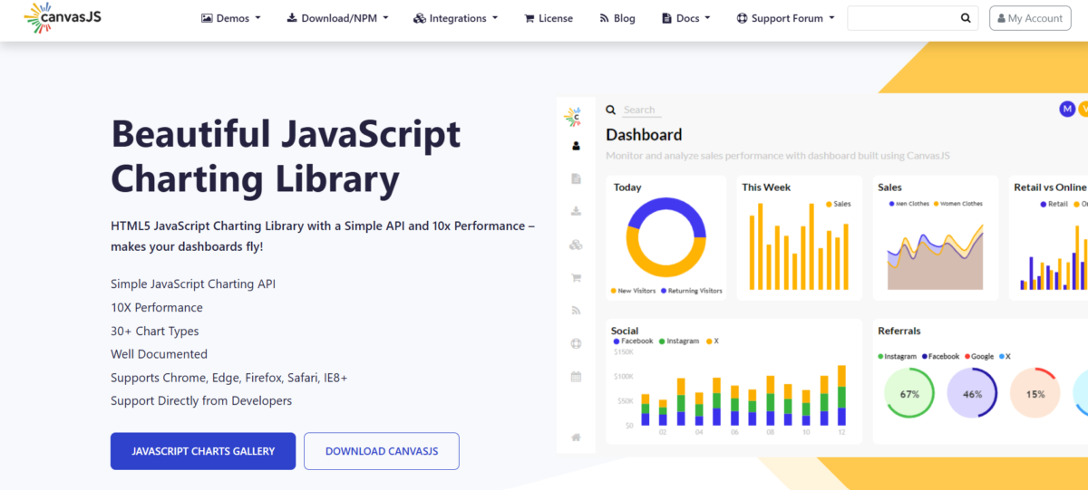
First launched in 2013, CanvasJS is known for its performance and ease of use, rendering charts based on HTML5 Canvas so that it can efficiently manage large datasets. It is therefore useful in dashboards that show thousands of data points.
With 30+ different types of charts available, including a StockChart for stocks and shares, this library is able to provide charts that display line, bar, area, and candlestick charts, as well as more specialist types, including funnel and pyramid charts.
Unlike some other libraries, with CanvasJS, you can get started with a few lines of code, as it has a simple API. It’s easy to add CanvasJS charts to your React projects, and it includes interactive zoom and panning for charts on both desktop and mobile devices. It’s simple to use, and most teams have a working dashboard up and running in just a few hours.
Pros:
- Fast HTML5 Canvas performance can process larger datasets
- Simple API means less time coding and lower maintenance costs
- StockChart component is ideal for financial data
Cons:
- Less flexibility and customisation than the higher-performing GPU rendering libraries
- 3D and Geographical charts aren’t available
The downside: Pricing for the commercial license requires a contact, as no transparent pricing tiers are available online, which could mean an extended wait time for some.
Conclusion
Building React dashboards that deal with the kind of challenges of real-life use-cases with millions of data points, real-time updates, and custom interactions demands that you base your decision to select a chart library more on performance and capabilities than on GitHub stars.
Of all the chart libraries we ranked, each of these makes specific trade-offs between extreme performance at scale and feature breadth and development velocity, respectively. If you’re rendering high-frequency financial tick data or building an executive dashboard with dozens of different chart types, or you are rapidly prototyping with as few dependencies as possible and no time to waste, pick carefully and benchmark your largest dataset on all of them.